The Tone is Theirs
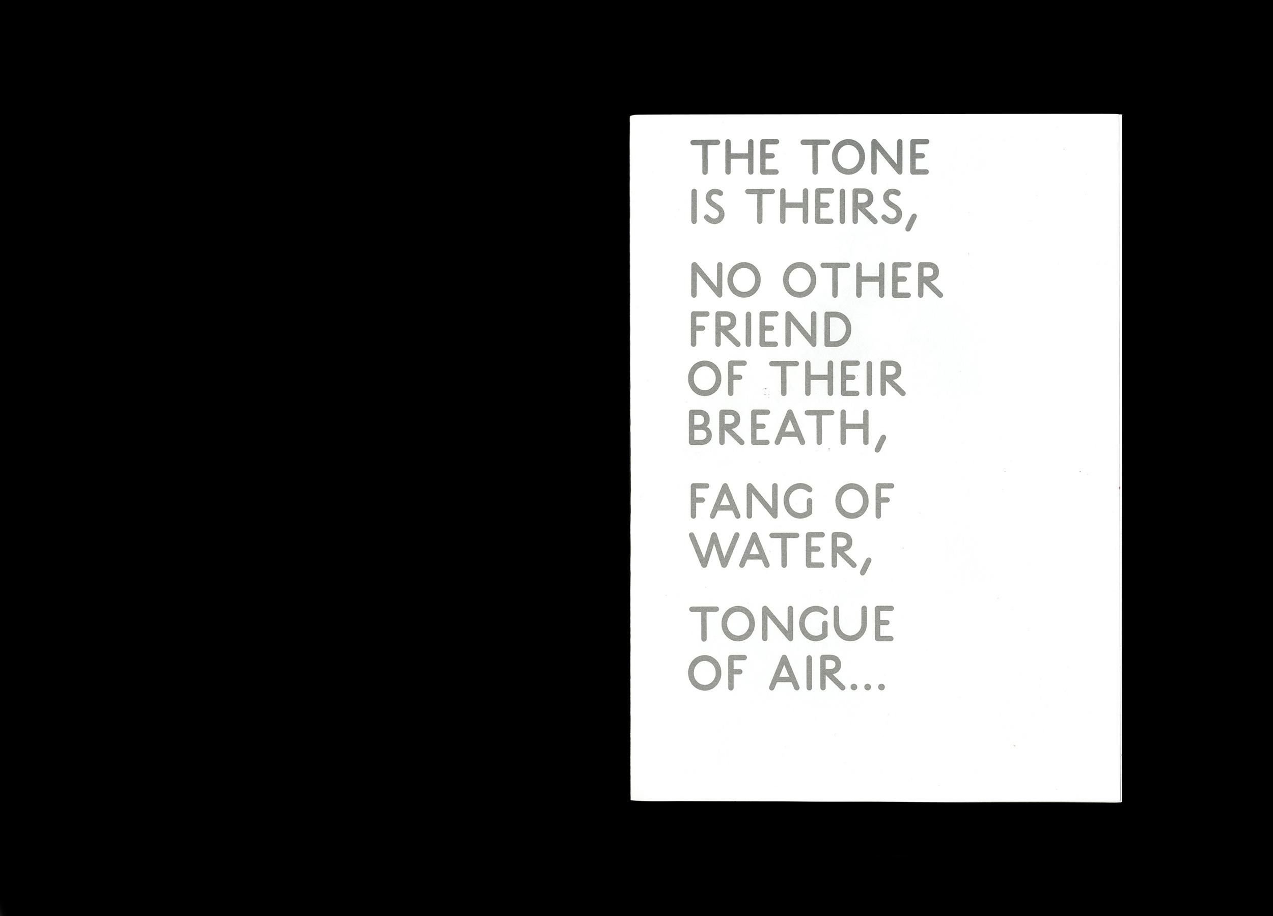
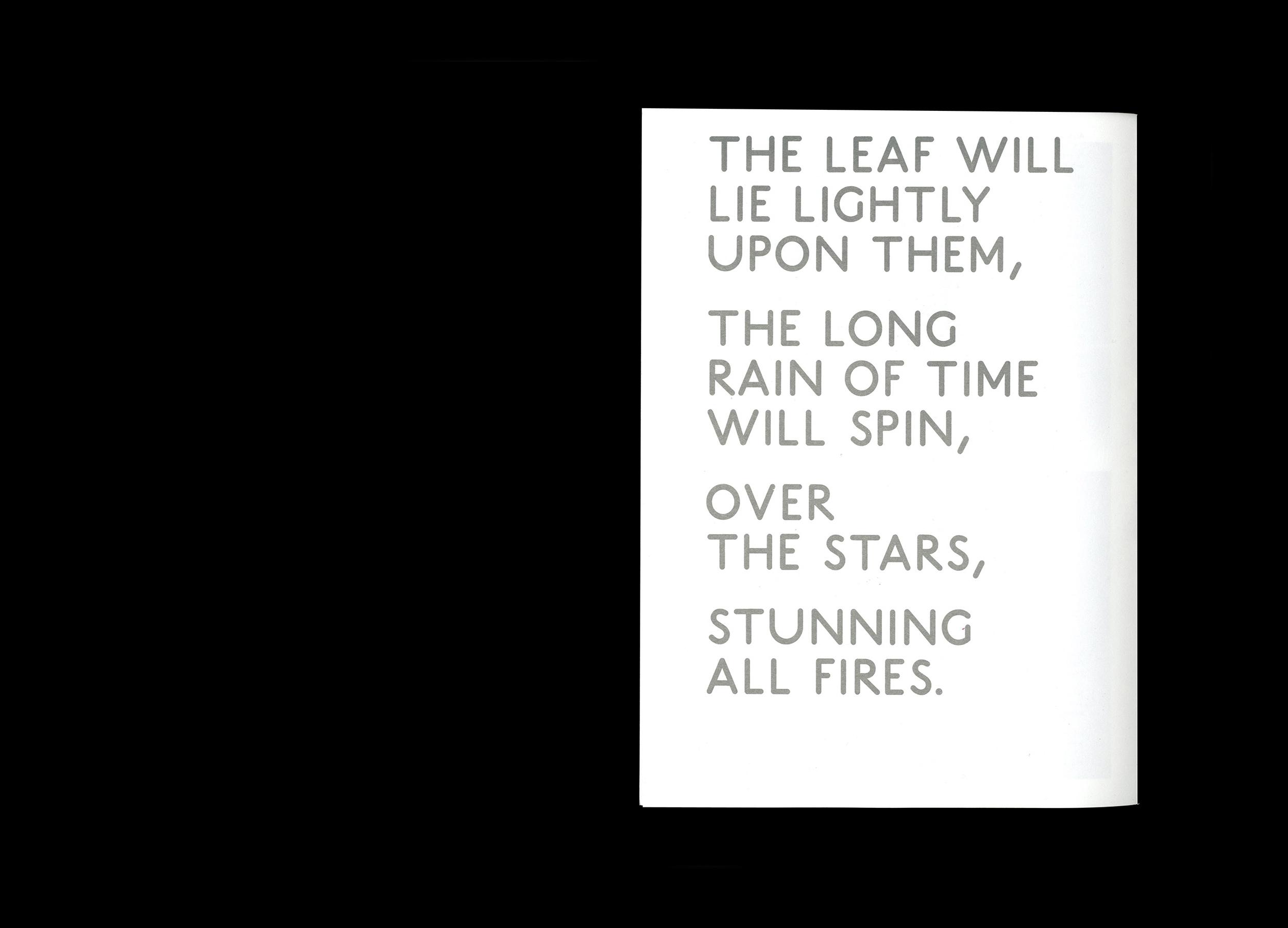
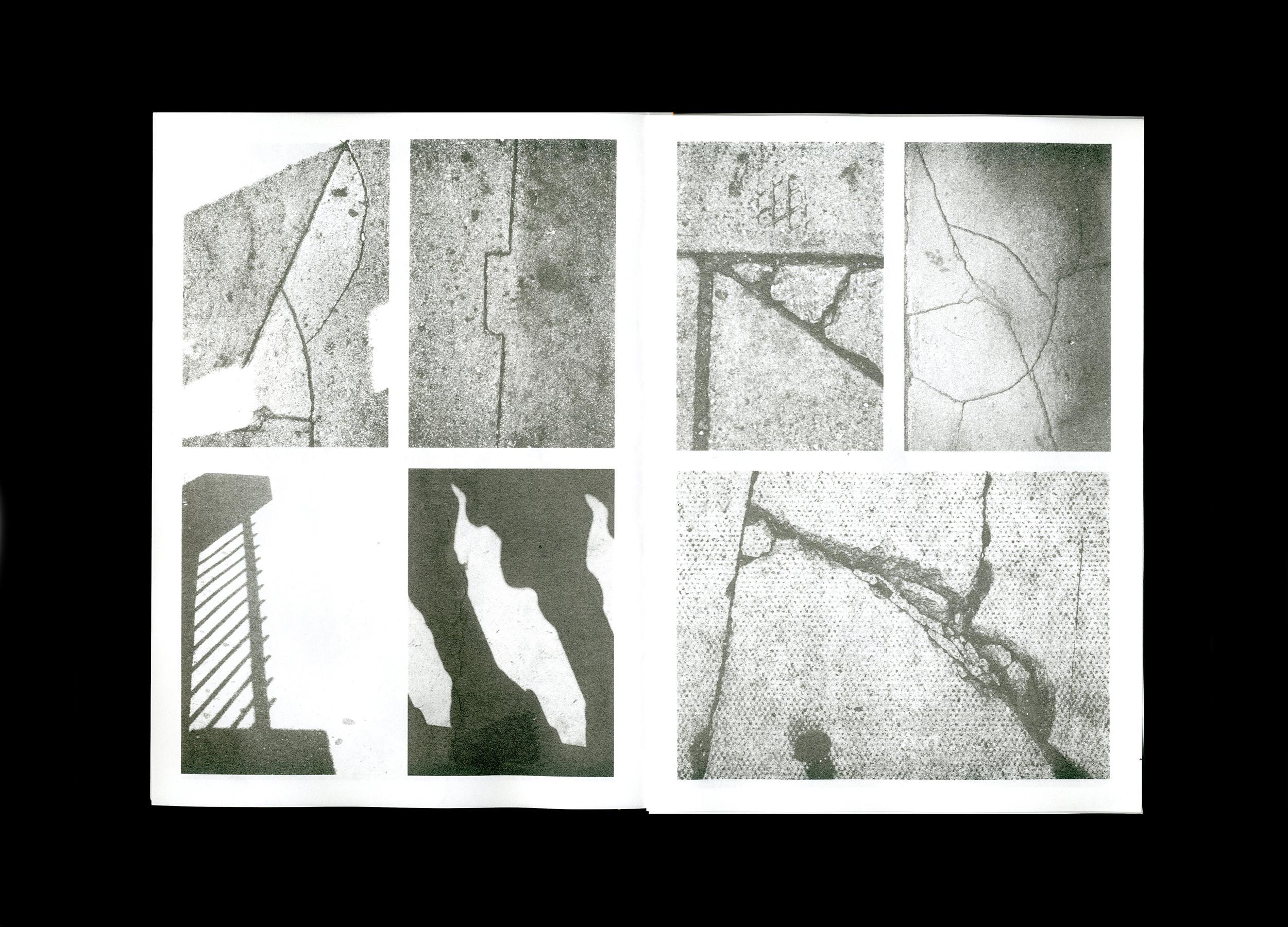
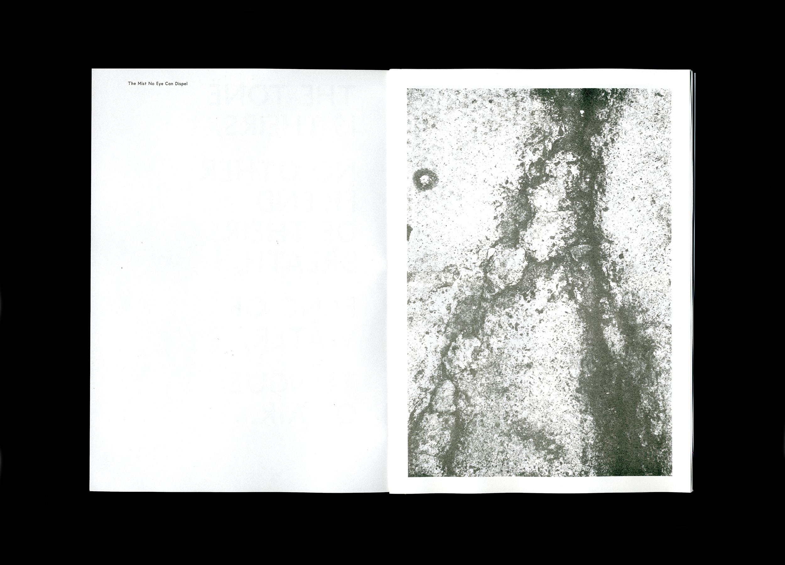
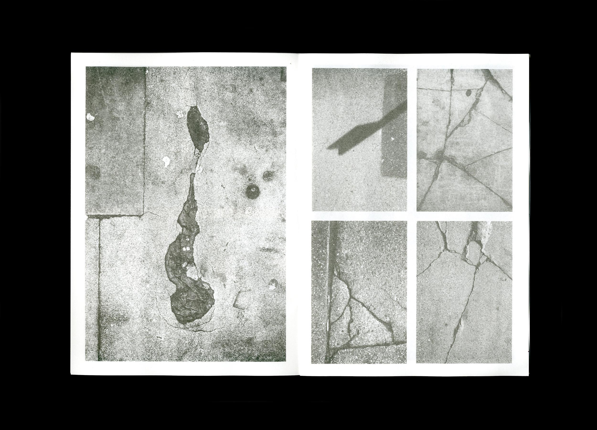
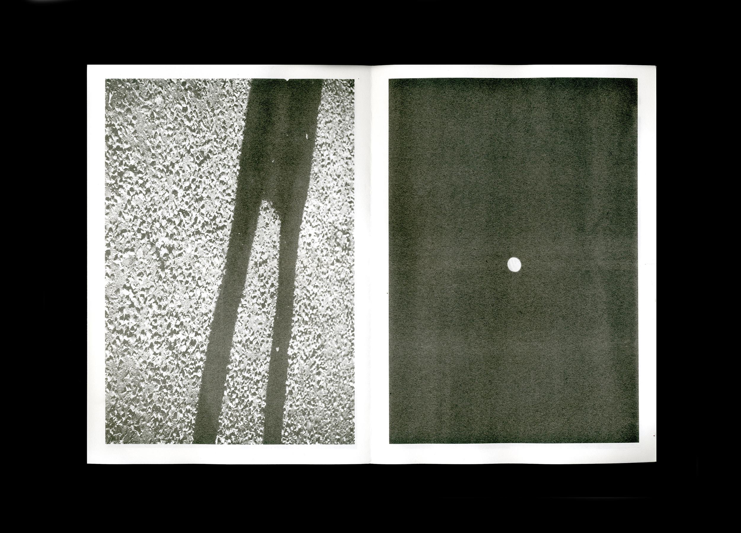
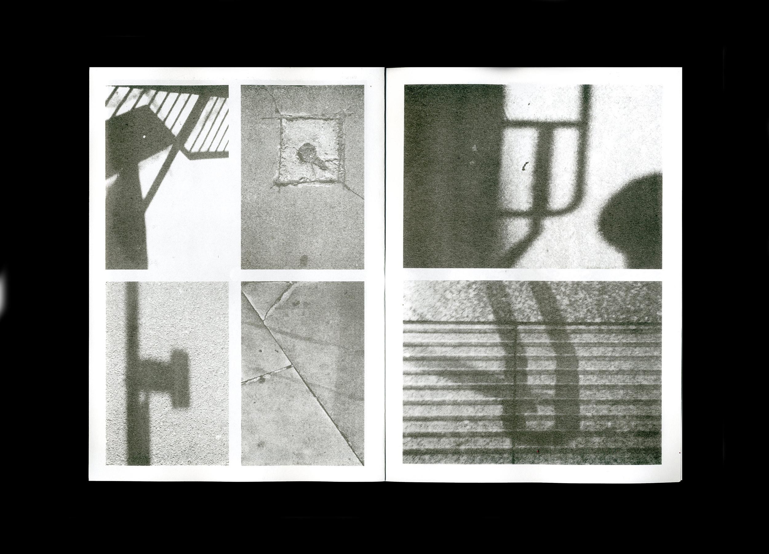
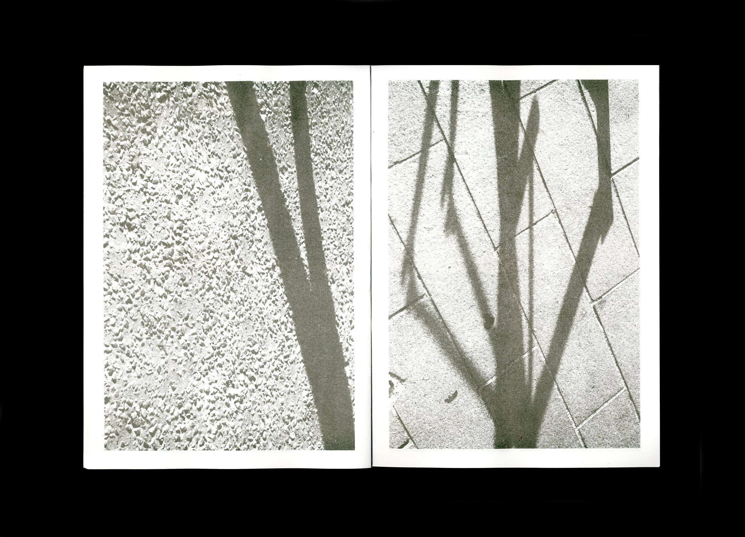
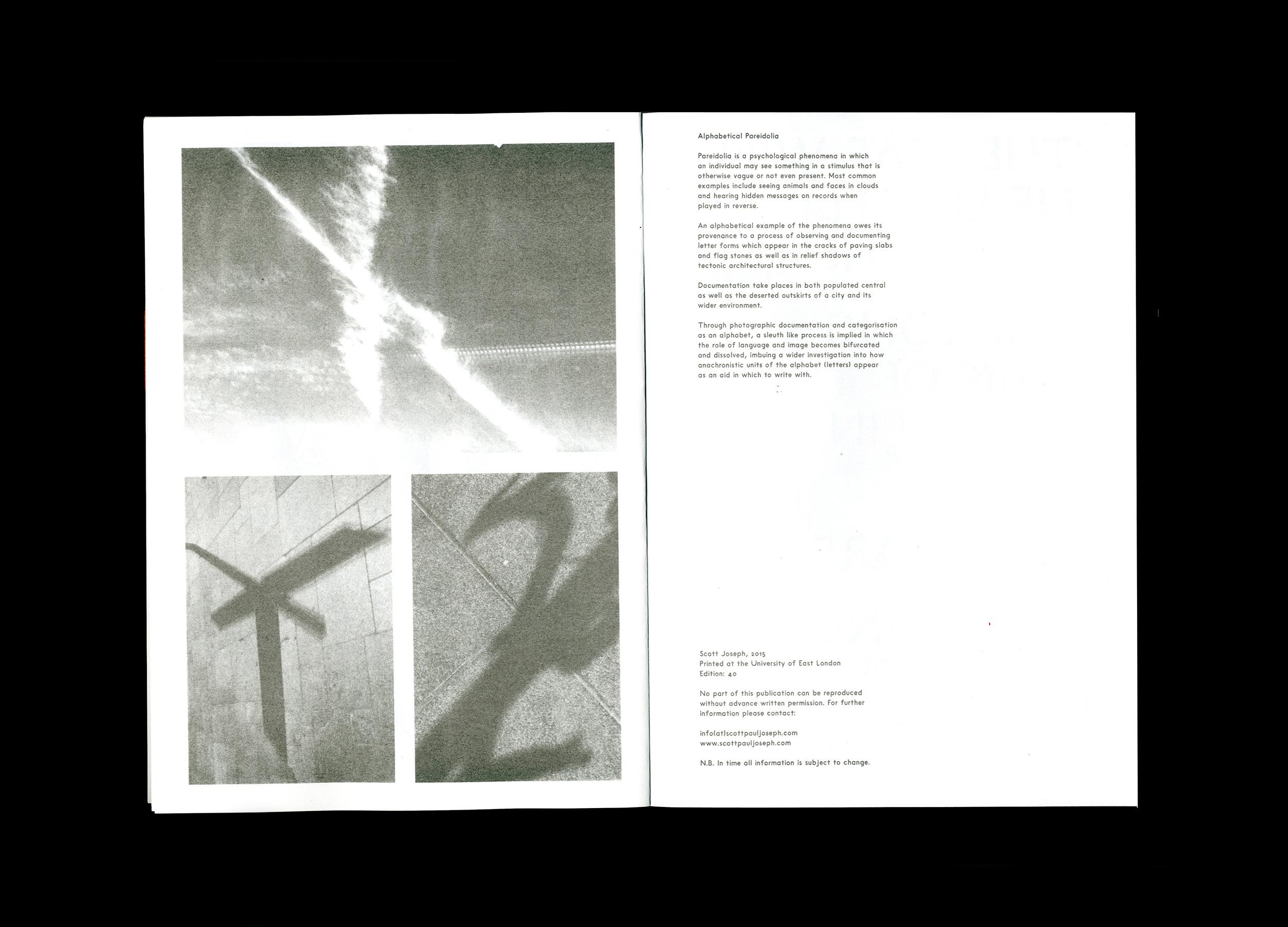
Image orientated type specimen representing a wider engagement into 'Alphabetical Pareidolia', and how humans see letters of the alphabet in archi-tectonic elements of the perceivable world around them.
Printed in grey, the context of each letter being found is formally made consequent through perpendicular framing, amalgamating how tessellation based structures co-exist alongside our visual perception for what is constituted through methods we associate between both reading and writing.
As an example: close inspection of erosion of solid materials reveals an almost humanistic trait, which is similar to our hands own surface anatomy.
Printing: Risography, 16pp, 210mm × 297mm
Production: University of East London
Purchase from: Lugemik, Tallinn, Estonia
With thanks to: Stephen Barrett and Andrew Osman